Abstract: Five tips for speeding up graph generation in Understand.
Most of Understand’s graphs generate very quickly, but when there are hundreds of nodes, it can take a while to figure out the optimal layout. Occasionally we hear about users who launch a graph and then wait hours or let it run overnight to get the result. For a one-time generation of very complex graphs, this strategy can work. However, in general, if a graph doesn’t generate within the first ten minutes, it’s probably not going to work. Rather than wait a whole day to get a frustrating “Layout Failed” message, try these tips.
1. Don’t wait
If a graph is taking a long time to generate, try to access the right-click context menu on the graph window. If it appears without any lag, then the graph is currently in layout. Chances are the graph you’ve requested has many cycles or complex clustering. In these cases, there is a good chance that the graph layout will fail and you won’t be able to see anything at all. But, you should still have the right-click menu available. This allows you to change global graph options to restart the layout with something more drawable. You don’t need a visible graph to start changing graph options.
What if you try to access the context menu and it doesn’t appear or appears after a lag? Then the graph is probably in content generation. In this case, it can be worth waiting. Architecture graphs, dependency graphs, comparison graphs, and relationship graphs can take a long time to build. But if you don’t want to wait, close the current graph and open the same graph using a smaller sample. Next, change the graph settings of the small sample and then recreate the original graph. Since graphs always use the most recently used settings, this allows you to change graph settings even when you can’t access the context menu.
2. Start small
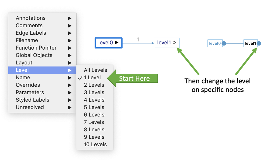
Most graphs in Understand allow the manipulation of specific nodes. For example, you can toggle whether a node is showing edges in or out, but you have to see the node to change the node settings. So, start small.
The Level option is probably the best example of this. Level one is a great place to start—All Levels, not so much. For butterfly graphs, there are two level options that end with the word “depth,” for example, “Calls Depth” and “Called By Depth” for the forward and reverse level of a butterfly calls graph.
Another graph option to be aware of is “Duplicate Subtrees.” This option can be available for the “classic” variant of graphs. Hiding duplicates can help reduce the total number of nodes in your graph, making it faster to draw. With this option, you can still expand the duplicated subtrees individually.
3. Start simple
Some graphs, such as cluster graphs, have a lot of node options. “Show Edges” is the most obvious option to select because there are usually icons on the graph to toggle it. Still, you can view the other options in the graph sidebar or in the context menu of a node/cluster:
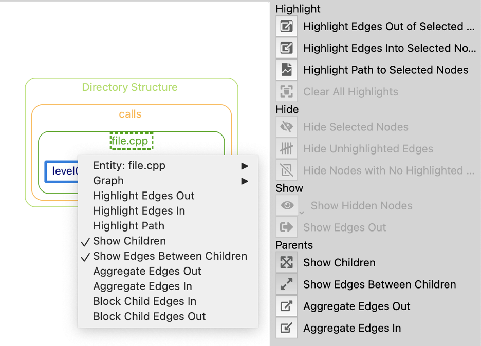
The graph level option works by changing the “Show Edges” options on individual nodes. In cluster graphs, there are two additional graph options that change node options: “Show Edges Between Children Default” and “Show Node Children By Default” Just like with the Level option, it’s better to start with these options off and only turn them on for nodes you need—this keeps your graph simpler and more likely to be drawable.
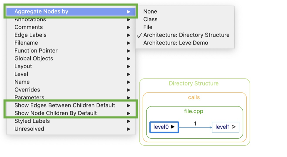
Another important option to keep cluster graphs simple is the “Aggregate Nodes by” option. Assuming “Show Node Children By Default” is off, increasing aggregation will generally help because there will be fewer nodes to layout. However, if many clusters are expanded, it’s possible that reducing aggregation will actually help graph layout. In that case, having fewer clusters means fewer constraints on the layout of your graph.
4. Pick the right graph
Suppose I want a good overview of my project, so I want to see calls at an architecture level. There are actually two ways to go about this. The obvious solution is to generate a “Calls & Called By” graph on my architecture.
I’ll use this sample code:
void level12() {}
void level11() { level12(); }
void level10() { level11(); }
void level9() { level10(); }
void level8() { level9(); }
void level7() { level8(); }
void level6() { level7(); }
void level5() { level6(); }
void level4() { level5(); }
void level3() { level4(); }
void level2() { level3(); }
void level1() { level2(); }
void level0() { level1(); }
With this sample architecture:
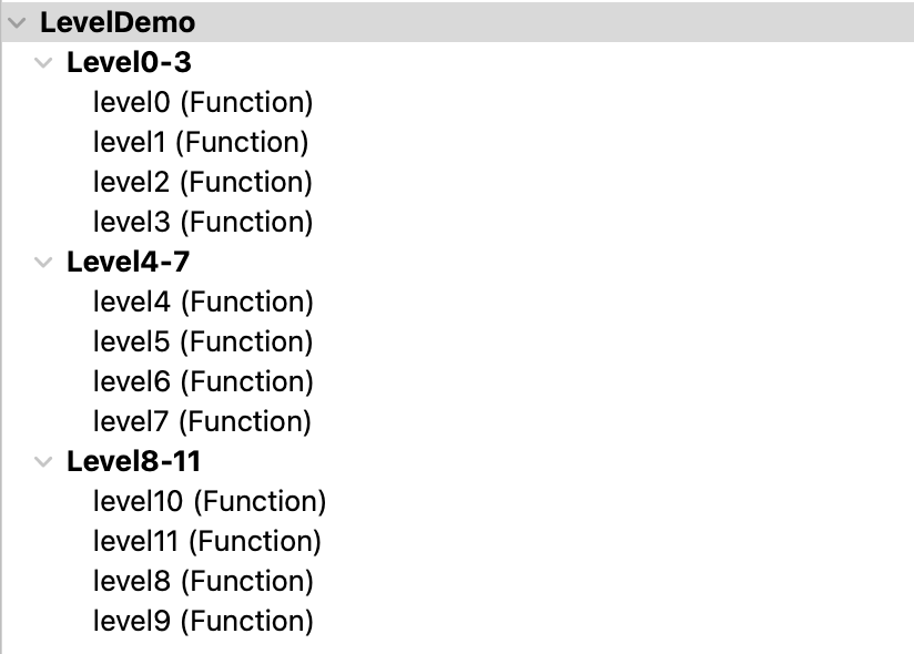
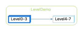
When I create a Calls & Called By graph for Level0-3, this graph will find all the functions in level0-3 and expand the call tree for each of them. The default variant is probably Butterfly (it’s configurable under Tools->Options->Graph), but I’m going to work with the Calls variant. This is my initial graph (Level=1, Show Edges Between Children Default = Off, Show Node Children By Default = Off):
If I expand both clusters, I get this graph:
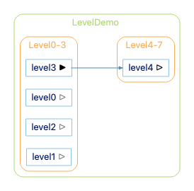
The gray arrows on level0, level1, and level2 happen because those nodes have show edges out on, but the edges aren’t shown. The edges are blocked because Level0-3 is not showing edges between children. We turned that off by default to keep our graph simpler. For this small sample, though, let’s turn “Show Edges Between Children Default” to On. Now we have this graph:

For this small sample, this graph works fine. But, the “Calls & Called By” graph can quickly become very slow. Remember that bit about this graph expanding the call tree for every function inside the architecture. Creating this graph from the Directory Structure architecture will have to create a call tree for nearly every function in the project.
There is a faster way to get this graph. Instead of generating a “Calls & Called By” graph, generate a “Dependencies” graph. Wait, but I only wanted the calls, not all the dependencies. That’s okay. When the graph first appears, you can use Choose Edges Shown and limit it to calls:
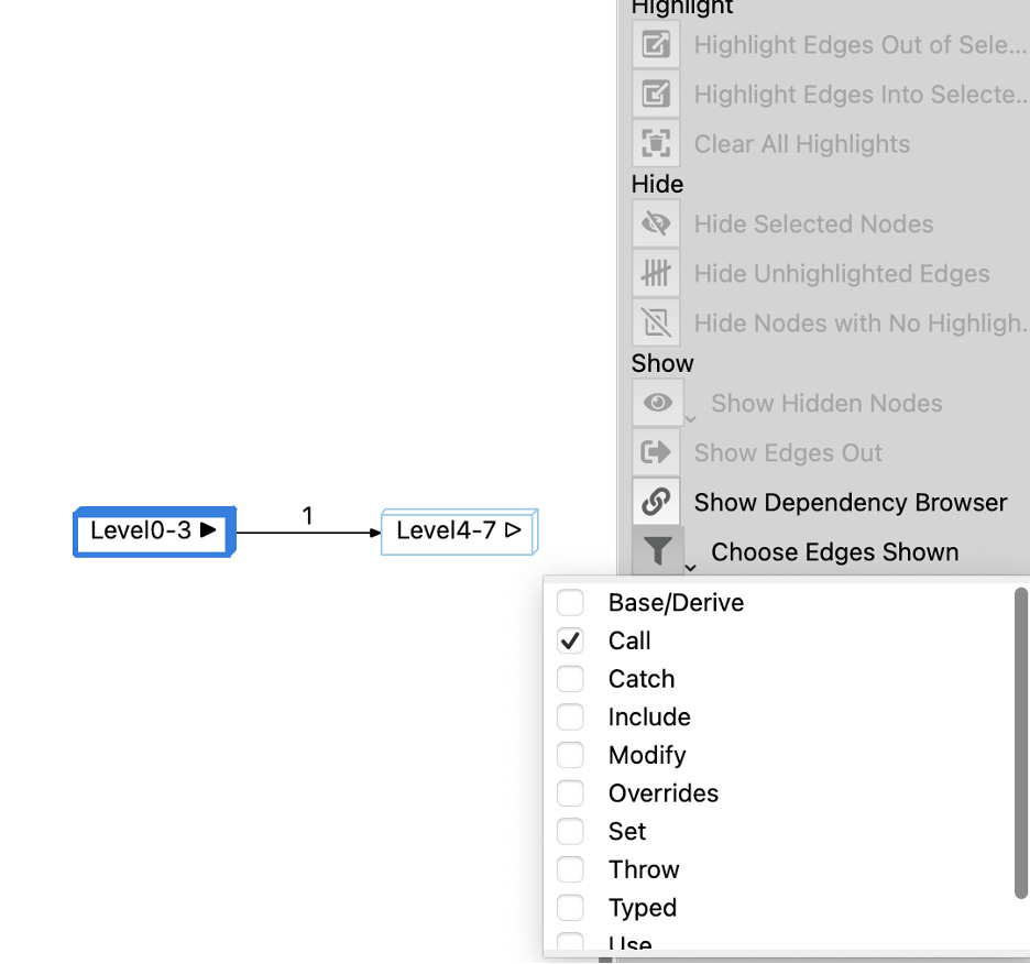
A dependency graph will take a little longer to generate the first time than a Calls graph on a very small architecture because it calculates dependencies for everything in an architecture tree. However, calculating dependencies for everything in an architecture is usually a lot faster than calculating a call tree for everything in an architecture.
So, why do we have the “Calls & Called By” graph at all? Here are a few reasons why you might sacrifice speed and use the “Calls & Called By” graph.
- You need to show calls to things that are outside of your architecture. In my LevelDemo architecture, I didn’t assign level12 anywhere. So, level12 will not appear in the dependency graph, but it will appear in the Calls & Called By graph.
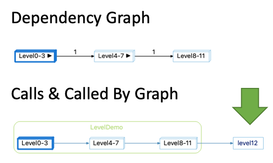
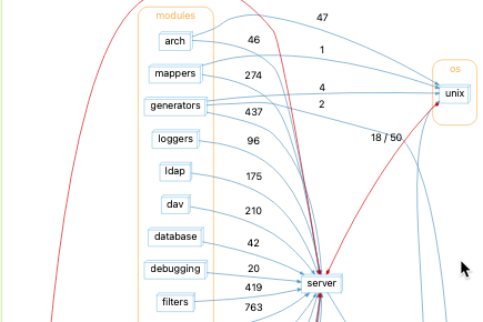
- You care that there is a direct path between the architectures. If we expand the initial Dependency Graph (with level = 1, Show Edges Between Children Default = Off, Show Node Children by Default = Off), this is the graph:
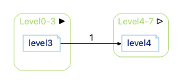
Expanding edges out of Level4-7 gives this:
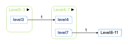
Notice that there isn’t a visible path from level3 to the Level8-11 node. In this sample, there actually is a path between them (which you could show by turning on “Show Edges Between Children”), but that doesn’t have to be the case. Showing edges out of Level4-7 shows all calls out of level4-7, regardless of whether those calls are part of a call tree that originates in Level0-3.
- You want the level option to control the depth of the call trees instead of the visible depth of architectures. With level=2, here are the two graphs.
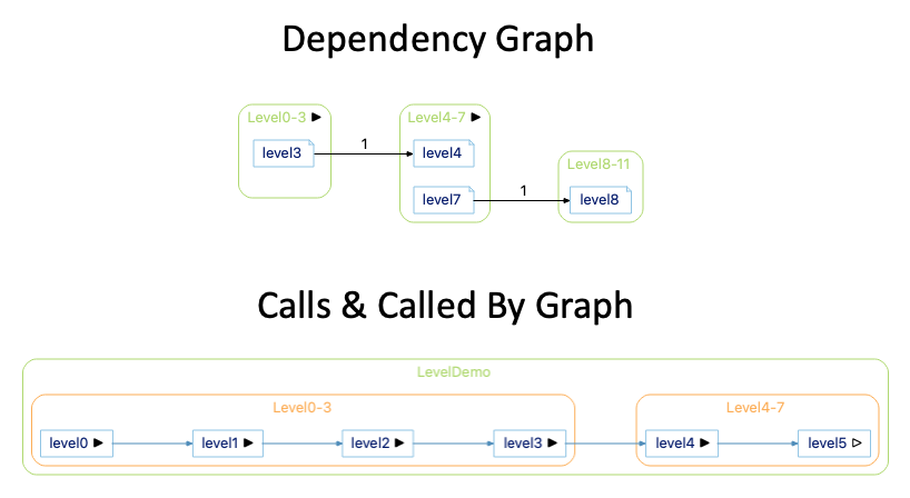
Expanding to level 2 in the Calls & Called By Graph expanded the level4 function so that the call tree from level3 has a depth of 2. But, expanding the level to two in the dependency graph shows two levels of architectures starting from the architecture Level0-3.
5. Pick the right variant
In “Picking the right graph” above, I mentioned that the default graph variant is a Butterfly variant. You can change the default variant from Tools->Options->Graphs.
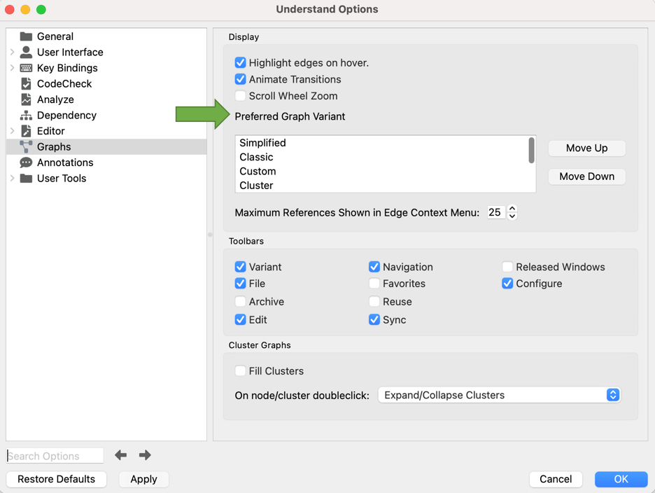
Butterfly is actually the fifth Graph variant in the list so it’s not visible in the screenshot. It just happens to be the first graph variant available for most architecture graphs.
The different graph variants have different contents and/or layout styles, so changing the graph variant can help you generate the graph faster. For architecture graphs, the “Internal” variant is usually faster than the “Butterfly” variant because it shows less information and therefore takes less time to generate.
For entity graphs, the Classic layout can be faster than the Simplified and Cluster variants because the Classic layout is always a strict tree with no cycles. If the same function is reachable multiple ways, then it is drawn multiple times. In contrast, the other layouts show each entity a single time and so the layout may have to handle cycles which can take longer. The Relationship variant takes a long time on graph content because all levels of the call tree must be expanded to find all relationships. Similarly, the Compare variant will take longer than the Simplified and Cluster variants because the additional step of calculating changes can take a lot of time.
If you do run into a graph that won’t finish generating, hopefully, these tips help. Checkout this article to learn about the different graphs you can generate with your code.


