Abstract: introducing custom line metrics in Understand – with examples showing coverage and violation information integrated into Control Flow and Data Flow Graphs.
After this article on showing coverage in Understand, we’ve had a few requests to show coverage information in Control Flow Graphs. So, we’ve added line metrics for build 1165.
Line Metrics
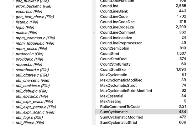
Until now, metrics in Understand have been entity metrics. So a metric like “Lines of Code” is available for entities like files, classes, and functions. Architecture and project metrics are built by combining entity metrics, so the Lines of Code metric in a project is the sum of the Lines of Code for all files in a project. Metric plugins, like the coverage metric plugin, work the same way.
However, nodes in a Control Flow graph represent regions in a file, not entities. So control flow graphs couldn’t use coverage information. Line metrics change that by providing a metric value for a line in a file. When a region covers multiple lines, the line metric values are summed across all the lines.
Line metrics are implemented with metric plugins. To get started writing your own custom metrics, check out the analysis errors and warnings metric plugin, the CodeCheck plugin, or the coverage plugin in our public scripts repository.
Control Flow Coverage
Now that line metrics exist, let’s use them! I’ll keep using the Open SSL project described in the initial coverage article. I want a Control Flow graph that is interesting (has branches) and relatively short. I’ll use the entity locator to sort functions by cyclomatic complexity since more complex functions have more control flow graph structure. I’ll limit the results to 20 lines of code to keep the graph short.

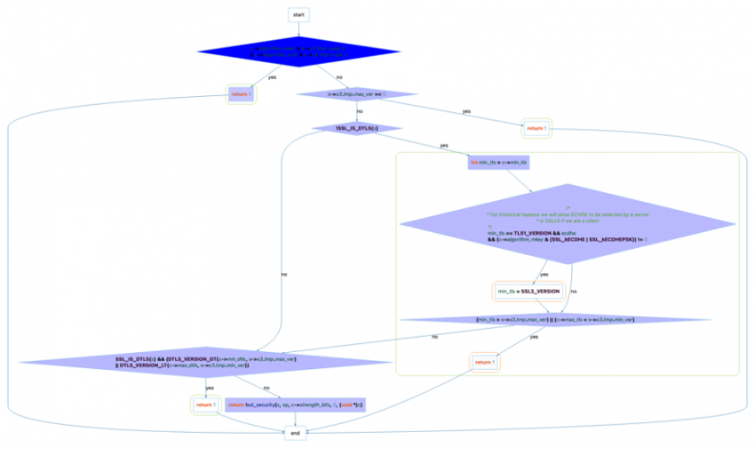
The first function listed just contains a switch statement. So I’ll use the second function, ssl_cipher_disabled.
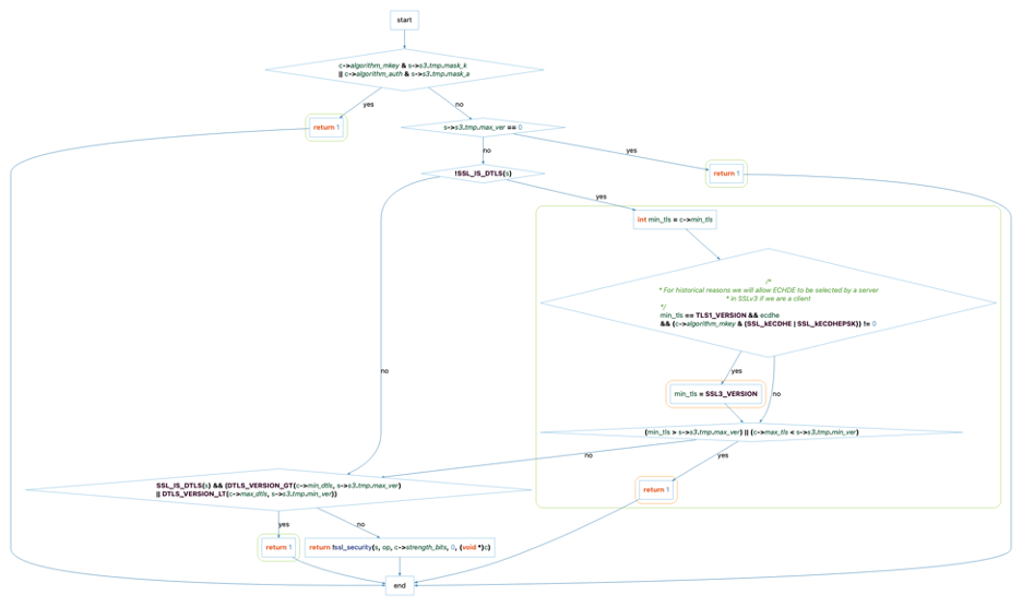
Now I need to add a metric color scale to my graph. If there are available line metrics, the metric color scale option will be available for Control Flow graphs, so I can follow the directions in this article to add a scale for Coverage Hits.
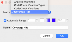
Adding a metric color scale only makes it available. I want to scale the fill color of the nodes by the amount of coverage. I can’t add a metric color scale to the default node because the default is the fallback if the metric value doesn’t exist. So I need to enable the “Control Flow Node” style from the Global Edge Styles menu to apply the style to all control flow nodes.
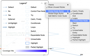
Now I can set the fill color on that style to Coverage Hits.
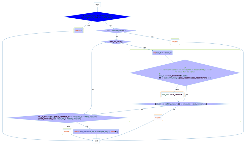
Highlighting Nodes with No Coverage
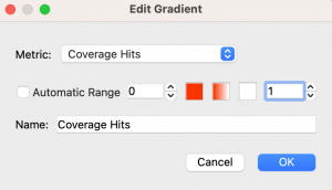
The graph is looking great, but I can’t tell the difference between a node that’s never been hit and a node that’s only been hit a few times. Were all three “return” nodes in the function hit? To highlight nodes that have a coverage of 0, I’m going to change my metric color scale to have a range of 0 to 1 with 0 red and 1 white. This means any nodes with no coverage will be red and any nodes with at least one coverage hit will stay white.
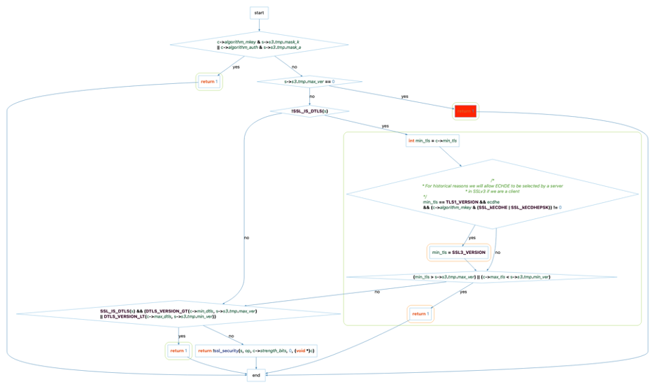
Now I can see that the top return was not covered by any of the tests but all the other nodes in the graph that could have had coverage information did have coverage information. Interested in this style? Drag and drop the control_flow_highlight_no_coverage.json file from the zip at the bottom of this article onto a graph window in Understand to import the graph theme and use it in your own graphs. Then use the legend hamburger menu to switch to the “Highlight Nodes with No Coverage” theme. You’ll need the coverage metric plugin installed and a lcov info file called coverage.info in the same directory as your Understand project.
Data Flow Graphs
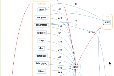
Coverage information is only available for files, functions, and lines. What if I want to look at a variable? The Data Flow diagrams show sets and uses of variables. Here’s one for open ssl’s do_engine_lock_init_ossl_ret_:

Because each edge contains references and references have line numbers, I can use line metrics to color edges! I’ll add a metric color scale for “Coverage Hits” the same as for the control flow graph. Then I’ll apply the color metric scale to the Use and Set edge styles.

Most of my lines are invisible since low coverage means white lines. I’ll change the metric scale to go from red to green:

Like before, I’m still not sure if the red lines have low coverage or no coverage. So, I can change the range on my scale again to 0 to 1.

It looks like the only reference to do_engine_lock_init_ossl_ret_ that is not covered by the unit tests is the ENGINE_get_last use. Is that because the function is never covered or only that the line in the function is never colored? I’ll change the line color of entity nodes (enabling the entity node style from the hamburger menu) to use the same color scale. Looks like ENGINE_get_last is not covered at all.

The style for the final data flow graph is the object_references_coverage.json file in the zip at the end of this file.
More Line Metrics
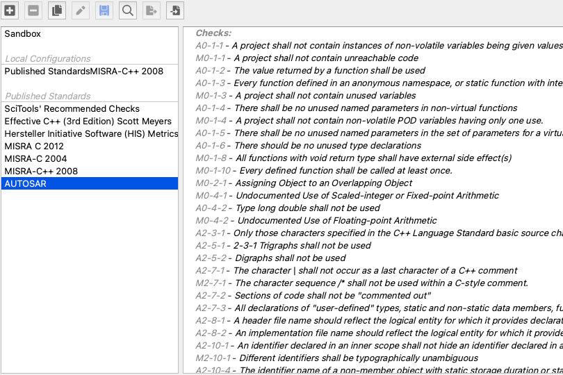
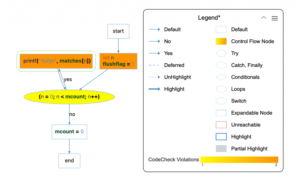
Coverage is not the only line information. Another one is the number of violations on a line from the CodeCheck metric plugin. Here’s a graph from the FastGrep sample project colored by the number of MISRA C 2012 violations on each line:
Interested in other line metrics? We’d love to hear from you!

