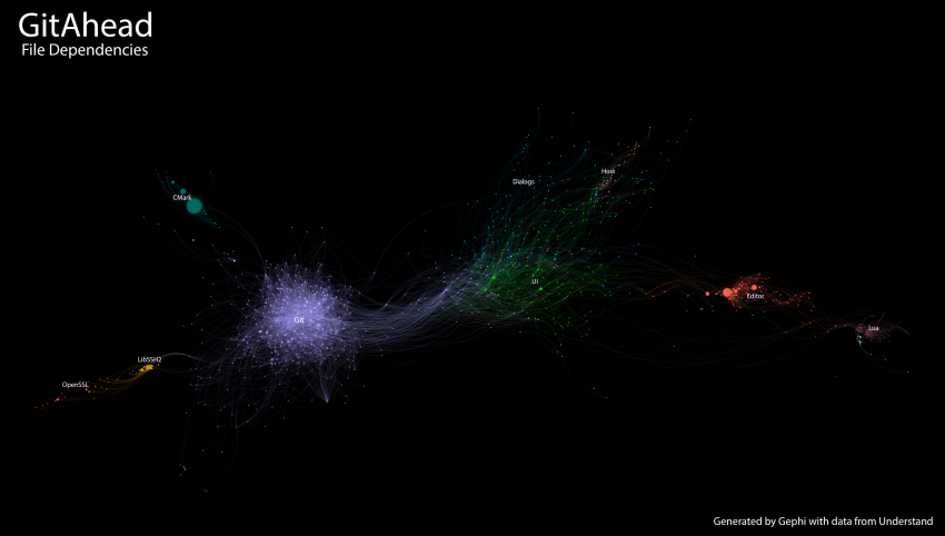
Full-size image of the above graph
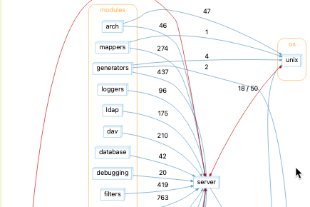
Editor’s Note: This capability has since been added natively to Understand using the File Dependencies graph. Here is an example
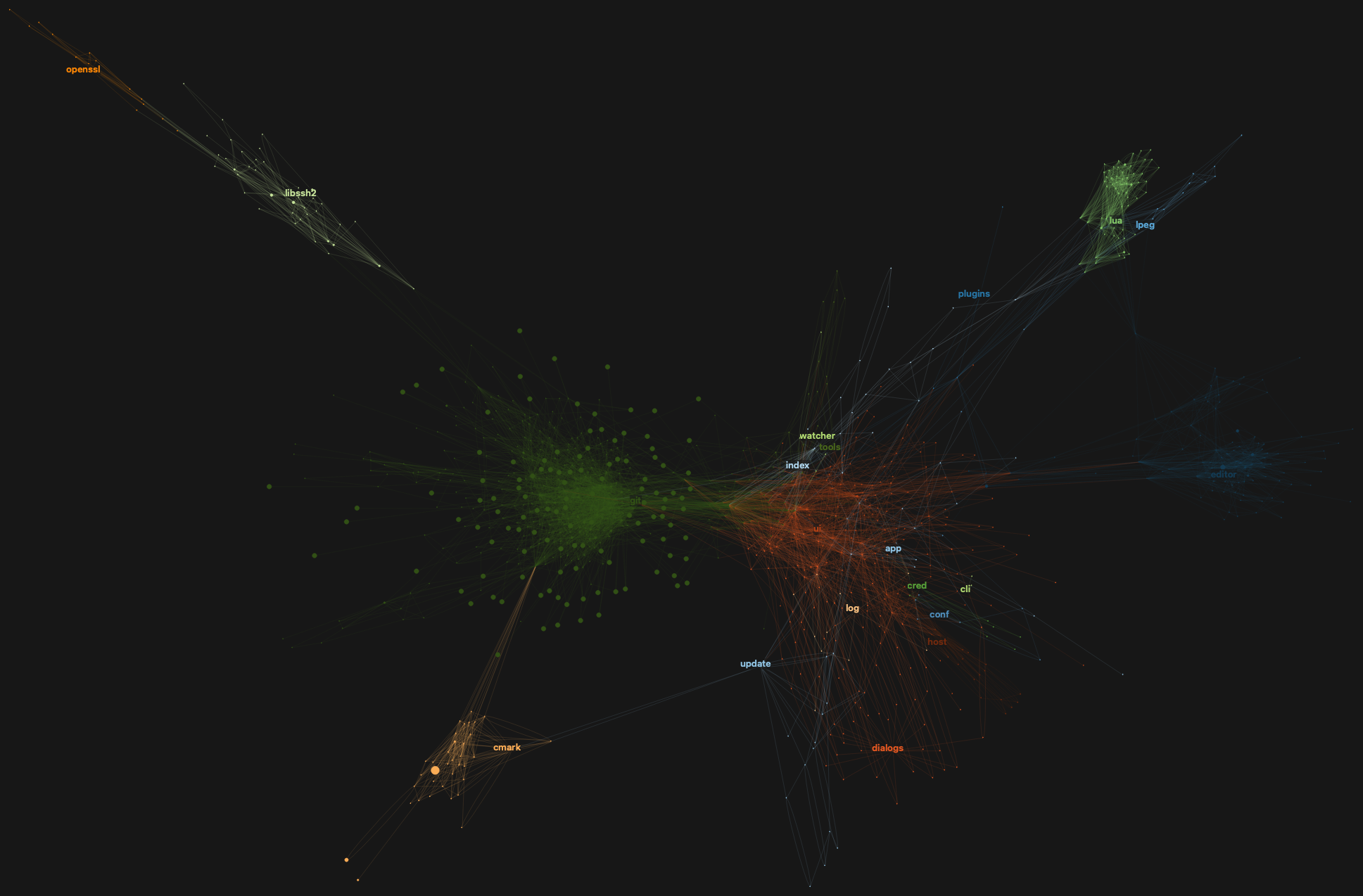
Abstract: Five minutes with the free tool Gephi lets you turn Understand’s dependency data into a gorgeous overview of your project.
Understand has some amazing graphs for exploring and learning about your code. Lately, we’ve been trying to tackle the problem of scalability with our graphs. Our layout algorithms slow down when over a few hundred nodes are on the screen. While brainstorming solutions, I came across the open-source graphing tool Gephi. After a small learning curve, I was able to make some very impressive high-level graphs from a large project. I’ll walk you through the process using our open-source git tool, GitAhead; it has about 1,000 files and 350k lines of code.
Generate Dependency Data with Understand
First, we’ll need to gather the dependency info from Understand to see how the files relate to each other. Understand has a built-in dependency export under Project-> Export Dependencies. I used it at first but eventually decided there was more information I wanted, so I made a custom Python plugin using the Understand API that generated exactly what I wanted. The custom script has the columns named how Gephi prefers them and includes complexity and line counting metrics as well as any architectures that the files belong to. This will let us add several more layers of meaning to the graph. You can download the script from our script repository.
To run the script, use our custom python, upython, that ships with Understand. The command from your terminal should look like this:
upython gephi_dependency_export.py src/gitahead/gitahead.und
It will create two new files – nodes.csv and edges.csv chock full of information about your project that we can import into Gephi.
Import the Files Into Gephi
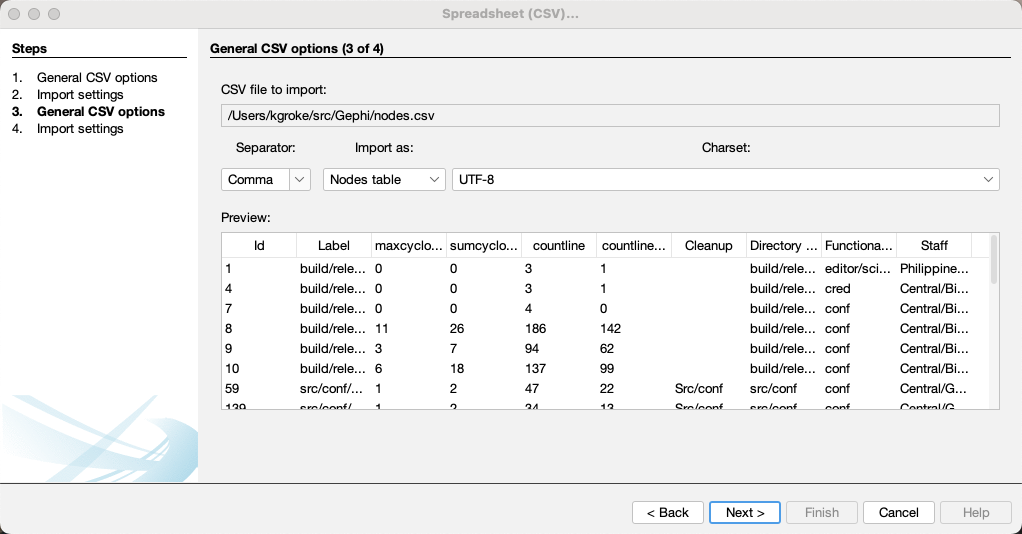
If you haven’t already, download and install Gephi. Launch it, select File->Import Spreadsheet, and select both of the files we just created, nodes.csv and edges.csv. The import wizard will walk you through the import; you can leave the defaults and select next on each page.
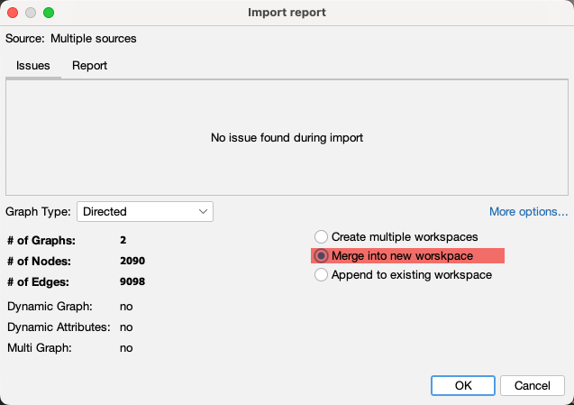
On the summary screen at the end of the import, make sure to select “Merge into new workspace” to let Gephi know that the two files are related.
Pick a Layout
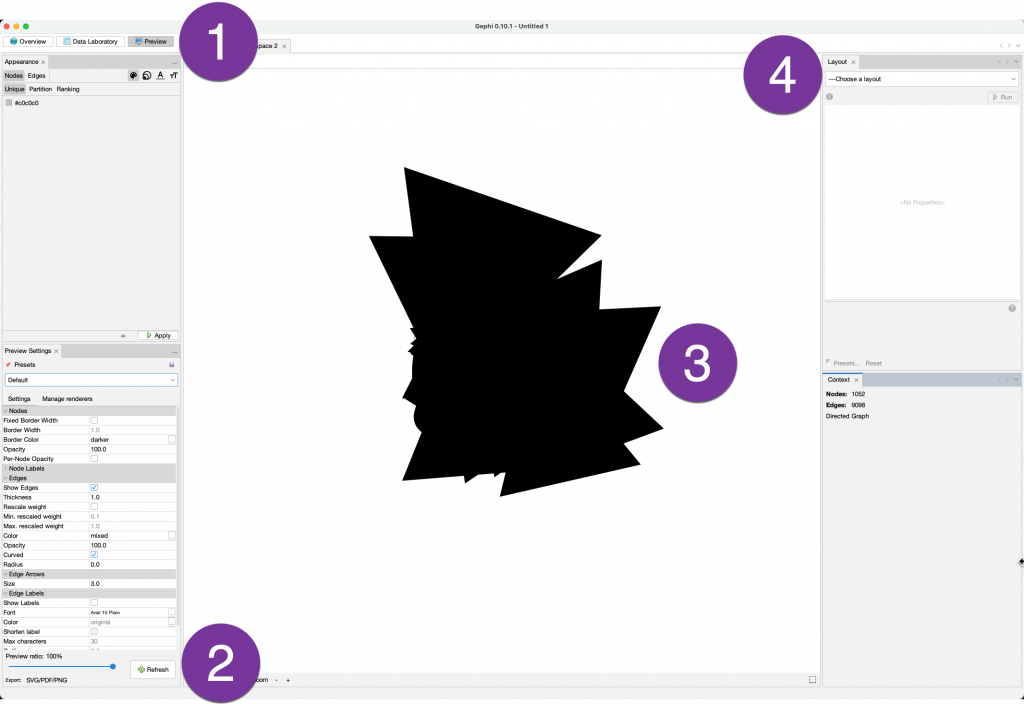
Now switch to the Preview Persona in the upper left (1). To update the preview, you will need to hit the Refresh button(2) on the bottom left every time you change a setting. Hit it now, and you’ll see Gephi’s awe-inspiring default layout(3).
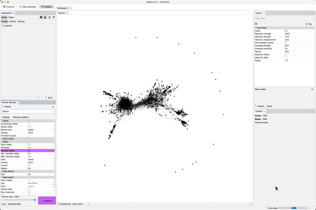
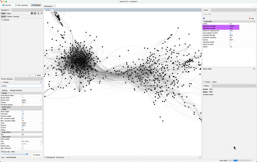
The Layout tab(4) lets you try different layout algorithms. Explore them to see what you like best. I seem to have the most luck with the Force Atlas layout. Select it and hit the Run button. At least we can see some nodes now, but those arrows block everything. They are massive because they are weighted for the number of dependencies in the file, so let’s rescale them. Click the Rescale weight in the Preview Settings Window on the left and hit the Refresh button again.
Now things are starting to get interesting. The clusters are bunched tighter than I like, so I will increase the repulsion strength in the Layout. Of course, don’t forget to hit the refresh button again.
Add a Splash of Color
The Appearance panel in the upper left will let us add color. Let’s color it based on a custom Architecture. This panel is a little confusing, so we’ll take it step by step. (1)Make sure color mode is selected and select (2) Nodes->Partition. The dropdown list(3) has the different groups you can choose to reflect with the color. I created a Functional Decomposition architecture for this project to break it down into meaningful groups. You can get pretty close by picking the built-in Directory Structure which will also show on that list.
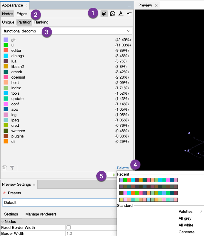
By default, only 8 colors are assigned. The Palette option(4) lets you specify more colors or generate new palettes. After you select the colors you like, hit the Apply button (5). I prefer the graph in dark mode, so in the lower left corner of the Preview, under your graph, click where it says Background to change that color too, and then refresh.

Pick a Metric for Size
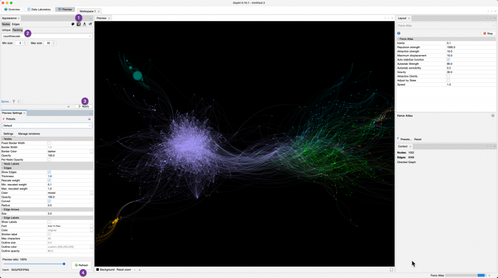
I really like how this is looking. We can also layer more information over this by resizing the nodes. Using that same Appearance pane that we used to add color, switch to the size icon(1), select ranking(2), and then select the metric you want to see in the graph. I selected Lines of Code (SLOC). The script also includes several complexity metrics, but you can also now add your own custom metrics to Understand. I played with the Min and Max Sizes for the nodes to find what I liked and settled on a range of 3-50. Then click the Apply(3) and Refresh buttons(4) as usual.
Export and Enjoy
Now let’s save this for use elsewhere. Next to the Refresh button, look for the Export option – which definitely does not look like a button, and click it.
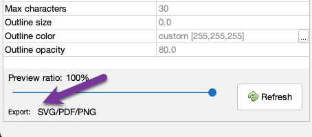
You can save it with the default settings or click the advanced option to specify a larger size. That’s it! You now have a fabulous overview graph of your code!

For extra credit, let’s open it in Photoshop to add a title and label the larger architectures we colored earlier. This should only take a minute or two.

Let us know if you want to see views like this native in Understand!

