Abstract: How do you know what a variable impacts? This article shows some existing graphs that answer part of the question and introduces two new graph plugins.
Suppose I have a global variable “global_1” (clever naming, right?) and I want to know everything “global_1” impacts. What graph(s) can I use?
Data Flow Graph
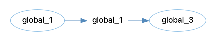
I could use the “Data Flow Out” graph. This will show me which functions use “global_1” and what globals are set by those functions. If those global variables are in turn used by other functions, the graph can grow to show those additional levels.
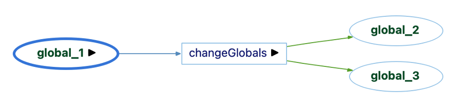
So, “global_1” is used by one function, and that function sets “global_2” and “global_3” (yep, more clever names).
Variable Tracker Graph
But, a Data Flow Out graph doesn’t necessarily mean that the use of “global_1” had anything to do with the sets of “global_2” or “global_3”.
For set references, we have a handy Variable Tracker graph (as described in this article). So, I can look at the set references of “global_2” and global_3” directly.


So, global_1 directly impacts global_2 since it’s assigned to it.
Inverse Variable Tracker Graph
But, creating a Variable Tracker graph for every object in a Data Flow Out diagram would take a lot of time. I’d like a graph that starts from “global_1”. That’s where the Inverse Variable Tracker graph (a plugin) comes in. It starts from “global_1” and sees where it gets assigned.
Problem solved!
Assignment Graphs
By the way, the Assigned To built-in graph could also be used. The difference between it and the Inverse Variable Tracker graph is whether the source code at each assignment is shown. An Assigned To graph only shows the variables without the source code.

Similarly, the Assignments built-in graph is very similar to the Variable Tracker graph without the source code, except Assignments will only show connections between variables and the Variable Tracker graph can also show assignments to literal values. So, it exists for “global_3” as shown below, but not for “global_2” which is set to 10 rather than a variable.

Source Code
So far, everything in this article has existed for a while. Why are new plugins necessary?
In graduate school, I had a colleague whose favorite saying was “Look at the data.” It is fairly easy to take data, run some algorithms on it, and then only look at the final output. That approach often led to trouble when the data itself was bad or one of the intermediate algorithms wasn’t understood or set up correctly.
So, let’s take the advice and actually look at the source code.
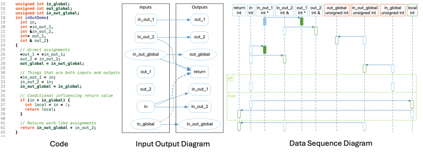
int global_1, global_2, global_3;
void changeGlobals()
{
  global_3 = global_1;
  if (global_1)
    global_2 = 10;
}
As the graphs showed, “global_1” is assigned to “global_3” and “changeGlobals” does use “global_1” and set both “global_3” and “global_2”.
However, it’s not true to say the “global_1” has no impact on “global_2” since the value of “global_1” is a condition for setting “global_2”.
All the previously described graphs are built using references. But the relationship between “global_1” and “global_2” isn’t a reference. Instead, it’s implied by the control flow of the function.
Input Output Diagram
So, the existing graphs, while accurate, don’t address my complete question. It’s time to write a new plugin.
Could I just modify the existing Variable Tracker graph or Inverse Variable Tracker graph with the additional edges? I can use the control flow graph to determine that the use reference of “global_1” is inside the condition of an “if” and that the set reference of “global_2” is inside the body of that if statement.
But what if there was a chain of “else-if” statements, or nesting, or if “global_1” was part of the condition and part of the assignment. I’m not sure how to show all that, so let’s start simpler.
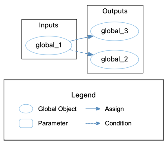
I’ll show all the inputs of the function (parameters and globals used) on one side and all the outputs (return value, globals set, and parameters that are pointers/references) on the other side. If something falls in both categories, I’ll show it twice. I can connect the assignments as before. Also, nifty trick, the assign references work for return values too because they exist between variables in the return statement and the function.
For conditionals, I can use my control flow plan. I’ll add edges from any input used in an “if” statement conditional to any outputs that are set or modified inside the body of that “if” statement. Here’s my new graph:
The plugin is accessible from our plugins repository.
Data Sequence Diagram
I like the Input Output Diagram, but it’s still limited. It won’t, for example, show indirect connections through local variables. It can also get very busy for complicated functions. Can I do better?
Well, a few weeks back I made a plugin version of the UML Sequence Diagram for a user to customize. The UML Sequence Diagram layout is a custom layout written for that graph. So, like the chart layouts, it’s possible to use it from an Understand plugin, but unlike the chart layouts it was written for a specific graph so it’s not very flexible.
Still, I like the idea of using the layout to show data interactions. So, let’s give it a go.
Styles
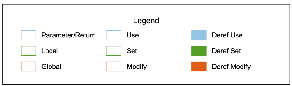
I’ll show uses, sets, and modifications of variables as activation boxes along each variable’s lifeline, colored by reference kind. To tell the difference between parameters, locals, and globals, I’ll have to use colors again because the layout doesn’t support changing other shapes.
Control Flow
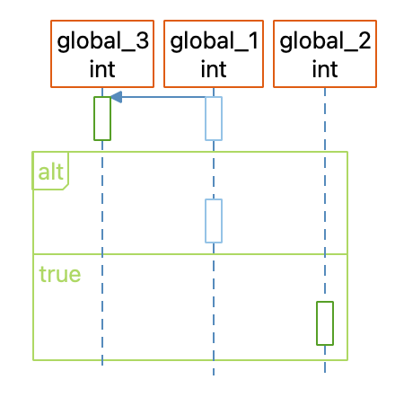
I can use control flow information the same way as the normal UML Sequence Diagram, with alt and loop clusters. However, I’ll break the sections apart a little more. The UML Sequence Diagram combines the condition and first branch of an alt or loop cluster, but I’ll make the first branch separate so it’s easier to tell what’s in the condition and what’s in the body.
I’ll also simplify my code a bit and always show all the conditions and loops whether or not they’re empty and use the control flow branch names (“true”, “false”) instead of the actual source code. The main reason is simplicity for me as the script writer, but if anyone asks it’s a feature intended to make the graph more complete and avoid the distraction of redundant source code.
Limitations
That’s a cool little graph plugin, but there are problems with it. For instance, in builds before 1242, the edge showing “global_1” is assigned to “global_3” won’t show up in the GUI although it is visible in some exports.
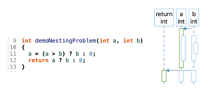
Also, the edge’s location is always determined the by the arrow head so it can get a bit off with nesting. Edges can also be unclear when there are a lot of variables in a single statement:
Still, for hijacking a layout algorithm written for a very specific use case, I’m impressed how robust the algorithm turned out to be. Good job past me.
Future
The Input Output Diagram and Data Sequence Diagram plugins still have rough edges. Should they be polished up? Would other views be more useful? Your feedback will determine the results. Let us know!