Abstract: a new graph plugin, “Calls & Called By – Internal with Objects” to visualize how functions and objects in a class or file connect.
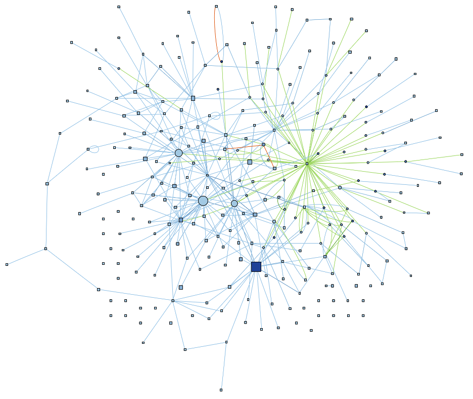
Near the top of the project home page is a graph called the “File Dependencies” graph. Here’s a full size version of the graph for the CMake source code (a local version that includes all directories, not the sample project). Isn’t it pretty?
I have to confess, I was initially sceptical. I thought a “spaghetti” graph, as I’d nicknamed it, would be completely useless. In fact, I was so confident that my boss had to do all the research himself, as documented in his blog article. Once he proved that a spaghetti graph was not only pretty but also informative, then it got added to Understand.
Now, having fallen hard for spaghetti graphs, I want to make one to get an overview of a class or file.
Natural Clustering
The main reason I changed my mind about spaghetti graphs is the natural clustering. I expected spaghetti graphs to be, well, like a plate of spaghetti. So many twisty edges in a big ball that nothing stood out as useful. In my defense, there are projects with “File Dependencies” graphs like that. But many projects, like CMake, have several distinct clusters.
So, in making a spaghetti graph for a class or file, let’s explore how the clusters also reveal information. For example, if the result is a single cluster, then the class or file is cohesive. Multiple clusters indicate the code does multiple jobs and should be split.
Function Styles
Clusters aren’t the only information in the File Dependencies graph. The size and color carry information too. In a File Dependencies graph, files are sized by lines of code and colored by architecture.
My graph will have functions, rather than files. Lines of code still works as a size metric for functions. It should make longer functions stand out more.
What about color? While functions can be part of architectures, there isn’t a built-in architecture for them. I’d rather follow tree maps and make more complex functions more obvious. So I’ll make the color scaled by Cyclomatic complexity.
Object Styles
At this point, I essentially have a custom “Calls & Called By – Internal” graph that uses a layout like the “File Dependencies” graph with size and color scaled like a tree map. But functions aren’t the only thing I care about in my graph. I also care about objects.
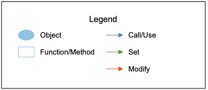
To keep objects and functions straight, I’ll have functions be squares and objects be circles. This follows the convention in most other Understand graphs, like “Object References”. While I’m following conventions, I’ll go ahead and use the same colors for edges as” Object References”, so calls and uses are blue, sets are green, and modifications are orange.
Ideally we will do some insightful scaling with objects too, but objects don’t have any built-in metrics. I’ll use a metric plugin to quickly create some new ones! Let’s keep the size related to quantity and the color following quality.
What would reflect an object’s “quantity.” How about the frequency it’s accessed? An object that is used, set, or modified more than another object should be bigger.
That leaves an object’s “quality”. For a function, Cyclomatic complexity is related to how many paths there are. For an object, then, maybe how many values there are. A constant is not very complex compared to an object that is changing. So, I’ll use the ratio of sets/modifications to uses. That should make objects that change frequently stand out.
Results
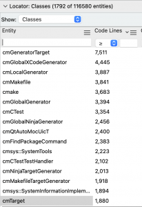
Time for the fun part. Let’s see how the graph works. I want to try files or classes that are big enough to be interesting. So, from my CMake project, I’ll open the entity locator and sort the classes by lines of code. Then I can try my graph out on the biggest classes.
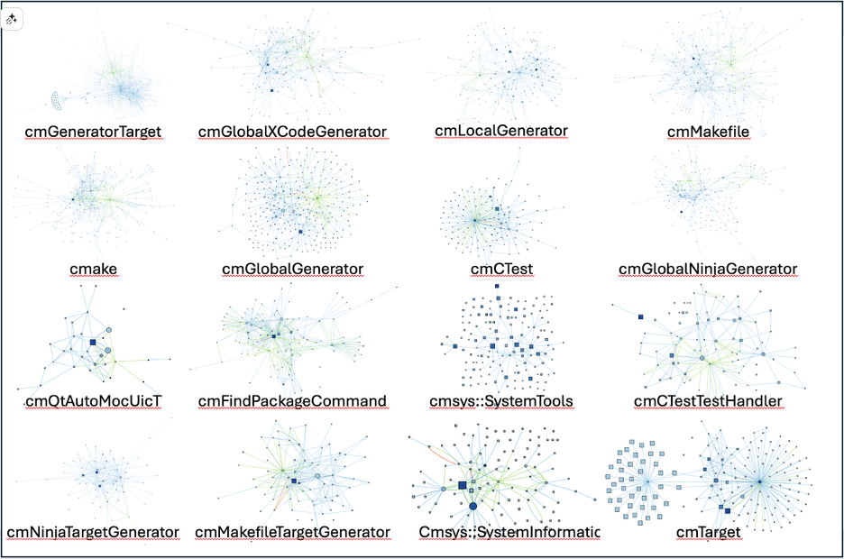
That’s a lot of graphs. So, let’s take a look at a few close up.
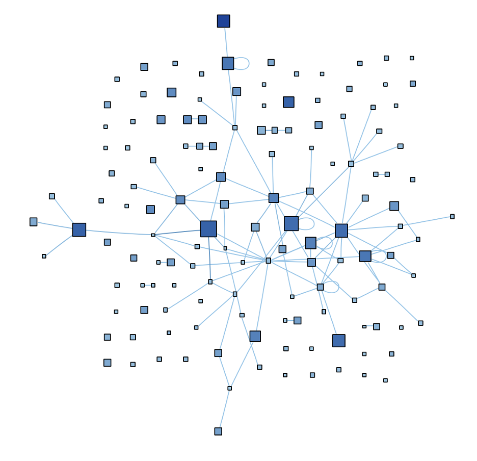
cmTarget
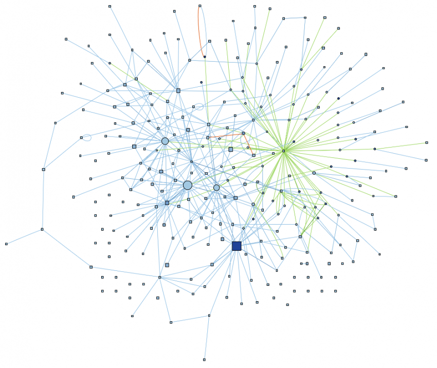
I find the graph of cmTarget, the 16th largest class with 1,880 lines of code, particularly interesting because of its two distinct and roughly equal clusters.
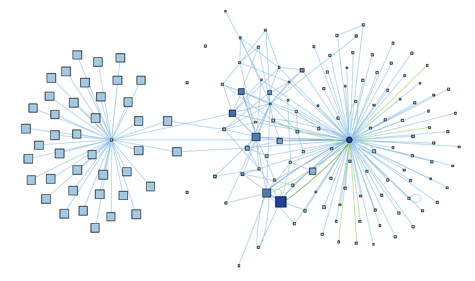
Based on the graph, this class might be doing two loosely connected jobs that could possibly be split. The left cluster is also interesting in that it surrounds a function, not an object. So, that short and not very complex function (which turns out to be GetPolicyStatus) seems to actually be quite central to how half the class works. The right hand cluster is centered around a variable (impl) which seems to be the key to the other half of the class.
cmGlobalGenerator
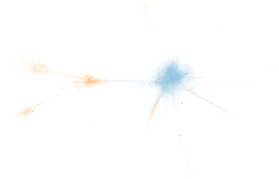
Let’s take another graph. The class cmGlobalGenerator is another one that stood out to me. It’s the 6th largest with 3,394 lines of code.
By lines of code and cyclomatic complexity, the big blue square in the bottom center seems like the most important function (EnableLanguage). However, the center of all those green edges on the right is also a function (cmGlobalGenerator), not a variable. So it seems like nearly every change to this class’s data goes through cmGlobalGenerator. If I had to understand what this class is doing, I’d probably want to pay attention to both EnableLanguage and cmGlobalGenerator, as well as some of the large objects just left of the center.
cmsys::SystemTools
Final one. Let’s look at cmsys::SystemTools, which stands out as being loosely connected. It’s the 10th largest class at 2,223 lines.
Most of the functions in the graph are disconnected and there are no objects. So, SystemTools seems to be a bundle of algorithms, with several large and complex functions. A few of the functions are recursive, visible from the looped edges. So, if I was trying to understand this class, I’d probably start by skimming through the function names to see what use case unites them.
Conclusion
It looks like this graph is a winner! I’ll call it “Calls & Called By – Internal with Objects”, so it will show up as a variant of the “Calls & Called By” graph when the plugin is enabled. Try it out, along with other cools plugins from our plugins repository. Is it a pile of spaghetti or a useful graph? Let us know!